Role | Designer - Brand research, user research, competitor research, web and brand redesign
Connecting parents with our nuturing and vibrant environment - @ City Way Nursery rebrand.
Personable
Staff at City Way Nursery are trustworthy and approachable and have great relationships with the parents of the children that they look after, meaning that parents will always feel comfortable.
Inclusive
City Way Nursery looks after children from all sorts of backgrounds and walks of life, meaning that not only are all children accommodated for, but that children are surrounded by diversity.
Personable
City Way Nursery's accessibility extends beyond its central location, offering care for funded children, emergency placements, and partnerships with local schools, making it a top choice for parents.
Flexible
City Way Nursery tailors childcare to each family’s needs, offering flexible pick-up times, sibling holiday clubs, transport between sites for after-school care, and various funding options.
City Way Nursery, established in 1963 and run by Sara and Scott Daly since 1999, is the longest-running day nursery in Medway. Located in Rochester, it cares for children aged 6 months to 11 years, offering services from 7:30 am to 6 pm, including breakfast and after-school clubs, a holiday club, and various funded options, while also providing food bank supplies and transport.
About City Way Nursery
Competitor Analysis
Results
The new brand identity of the business establishes it as a reliable and professional nursery, distinguishing it from competitors and fostering a positive perception among its target audience. The incorporation of vibrant colors gives the business a fun, modern, and child-centric vibe, while also honoring its Australian roots. Additionally, the use of nature-based imagery effectively showcases its curiosity-driven values.
The Rebrand
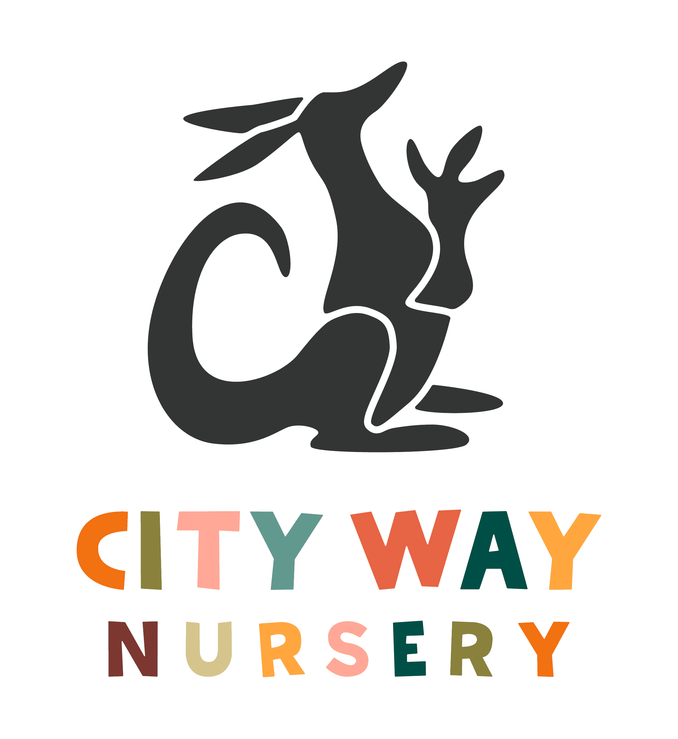
Primary Logo

Submark

Illustrative Elements
Primary Logo Pattern
Illustrative Elements
Charcoal
R: 51 G: 53 B: 53
#333533
C: 70 M: 59 Y: 56 K: 65
Cadet
R: 98 G: 153 B: 143
#62998F
C: 65 M: 23 Y: 45 K: 5
Bottle
R: 0 G: 79 B: 70
#004F46
C: 90 M: 40 Y: 65 K: 45
Pine
R: 58 G: 94 B: 50
#3A5E32
C: 77 M: 39 Y: 89 K: 35
Orange Peel
R: 255 G: 167 B: 62
#FFA73E
C: 0 M: 42 Y: 79 K: 0
Linen
R: 244 G: 234 B: 228
#F4EAE4
C: 5 M: 9 Y: 11 K: 0
White
R: 255 G: 255 B: 255
#FFFFFF
C: 0 M: 0 Y: 0 K: 0
Ecru
R: 293 G: 197 B: 141
#D5C58D
C: 19 M: 19 Y: 51 K: 2
Moss
R: 138 G: 129 B: 61
#8A813D
C: 44 M: 35 Y: 83 K: 22
Pumpkin
R: 242 G: 113 B: 17
#F27111
C: 0 M: 66 Y: 95 K: 0
Brandy
R: 124 G: 113 B: 17
#7C3731
C: 33 M: 79 Y: 70 K: 42
Flame
R: 231 G: 100 B: 68
#E76444
C: 3 M: 72 Y: 74 K: 0
Salmon
R: 255 G: 168 B: 151
#FFA897
C: 0 M: 45 Y: 36 K: 0
Colour Codes
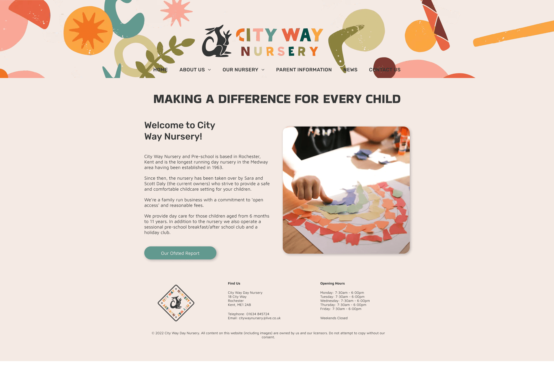
The Redesign
The new City Way Nursery website is designed to improve user experience, showing the nursery as trustworthy and professional. Bright colours and simple navigation make it easy for parents to use, while nature-based images highlight the nursery’s values. The layout is clear, and important information is easy to find, helping the nursery stand out from competitors.
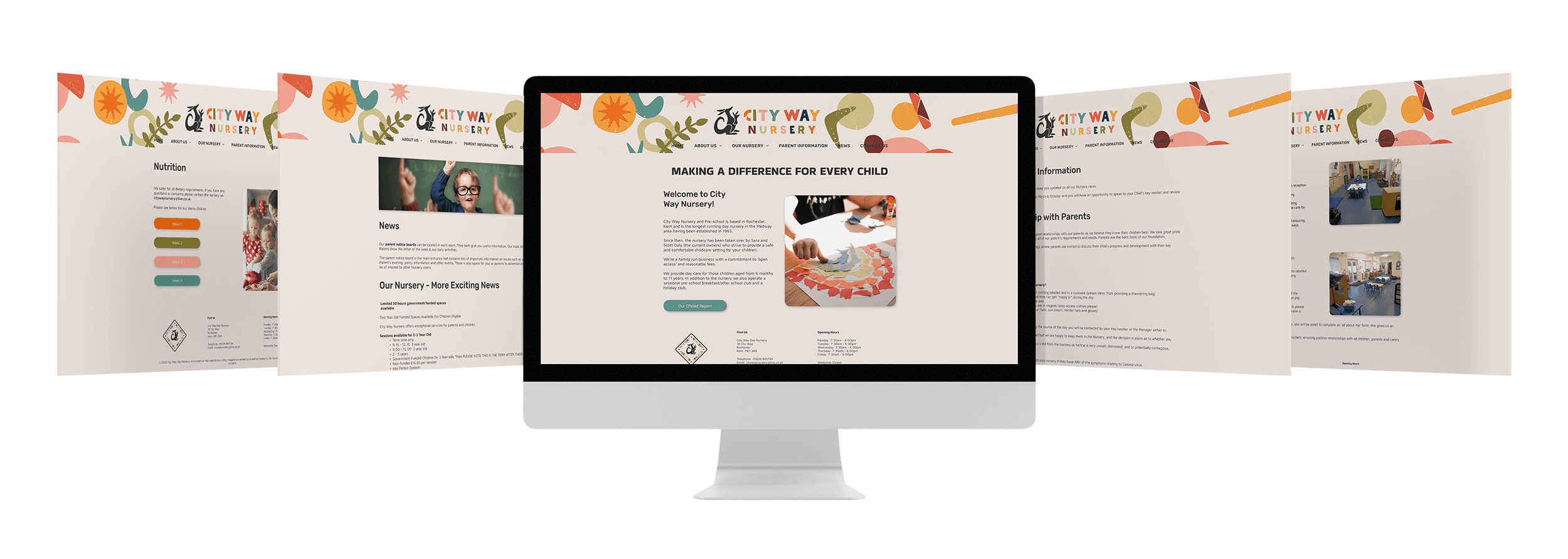
citywaynursery.co.uk
Website Statistics
In September 2024, City Way Nursery's website saw an increase in visits, rising to 278, which is a 6.1% improvement. However, engagement dropped by 12%, down to 22. This decrease is likely due to engagement being linked to parents applying for places, which tends to be seasonal based on school terms and intake times. Despite this, the rise in visits shows continued interest, which could lead to higher engagement in the next application period.
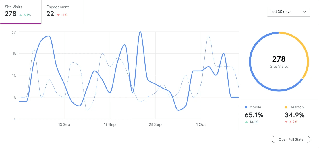
*September 2024 updated monthly
Impact
After the rebrand, we redesigned the website, created new graphic materials, and improved signage outside. The nursery now has a consistent and cohesive brand across all visual elements.
What I learned
I learned how crucial consistency is across digital and physical elements strengthen brand identity. This project also taught me how cohesive design can enhance both visibility and engagement
Takeaways
Final Takeaways
Nursery branding, both locally and beyond, often suffers from a lack of cohesion, excessive complexity, and a somewhat outdated appearance, which can make brands feel unprofessional. This presents an excellent opportunity for City Way Nursery to differentiate itself with a sleek, modern visual identity that is consistently applied across all brand touchpoints, ensuring it feels innovative, professional, recognisable, memorable, and trustworthy.
Hedgehogs Childcare
Brand Info
Hedgehogs Childcare is a Medway-based chain with locations in Rochester, Hempstead, Chatham, and Wayfield, offering curiosity-based childcare for children up to 5 years old since 2016.
Notable Visual Elements
Hedgehog illustration and playful, child-oriented font
Limited brown and cream palette gives a mature feel
Main font appears too mature and dated
Poorly designed website undermines credibility
Brand Info
Hedgehogs’ childlike font and illustration reflect the brand's focus and appeal to adults with muted colours. However, beyond the logo, the branding feels disjointed, featuring dated font choices and a mismatched website.
Kloisters Kindegarten
Brand Info
Kloisters, a Rochester nursery, has a generally positive public reputation but faces criticism from other childcare providers and Ofsted due to past poor ratings and limited funding options.
Notable Visual Elements
Basic, unremarkable logo featuring a simple sans-serif font
Illustrative elements appear on children's polo shirts
Extensive use of purple
Simple website layout, but lacks visual interest
Brand Info
Kloisters’ logo features a basic sans-serif font that lacks a child-oriented appeal. An illustrative logo appears only on the branded uniform, while the heavy use of purple is somewhat garish. Though the website is well-organised, it lacks visual interest.
Little Explorers Nursery
Brand Info
Little Explorers is yet another local nursery to City Way, which has an Outstanding Ofsted rating. The nursery offer childcare for ages 0-5.
Notable Visual Elements
Simple logo featuring a compass and child illustration to highlight the 'explorers' theme
Vibrant colour scheme
Header blends text with nature-inspired illustrations
Inconsistent branding across the website
Brand Info
While Little Explorers’ main logo is effective, the rest of the branding feels disjointed and inconsistent, using outdated italic serif fonts and a mismash of colours, illustrative styles, and typefaces. This makes the brand feel dated and unprofessional.